Apple may think that the iPhone and iPod Touch are the “funnest” ever, but I’d like to give the “touch” iPod implementation in these devices a new name: When it comes to controls, it is the frustratingest iPod ever! (Ok, maybe the Shuffle is slightly worse…)
Seriously, the simplicity of control was one of the prime factors (along with iTunes, the Store, and Ive’s design) that made the iPod a winner in a sea of loser MP3 players. I speak from experience, having been a hard drive MP3 player owner before the iPod was even announced! I gladly dumped my Nomad Jukebox with its ridiculous control setup when I received a fourth-generation iPod as a gift. Although it lacked many of the Nomad’s features, the iPod’s ease of use won me over. Put simply, I could actually use the iPod’s features!
The iPhone (and similar iPod Touch) is another story entirely. Although I remain impressed by the phone and app store, and have seen the mail and calendar interface improve, the “touch” iPod controls are just plain frustrating. Not because they’re bad, mind you. The fact that the touch iPod is so good is what makes the inconsistent and missing controls so frustrating!
A Portrait Of Absolute Perfection?
One would think, given the purple prose heaped upon it, that the iPhone was, like Oscar Wilde’s Cecily, “in every way the visible personification of absolute perfection.” But, although the iPhone replaced my 40 GB iPod for daily use, it remains frustratingly limited in control. Even the Apple Remote app is better than the native touch iPod controls! And, with the exception of the Genius feature, the iPod interface has remained static since the iPhone was first released.
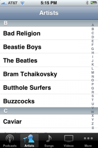
Selecting music, video, and podcasts is simple enough with the touch iPod interface, with a slick flick gesture augmented by a quick right-hand scroll between letters for large song libraries. Apple even lets you change the icons at the bottom of the screen – I added “Podcasts” to the list, since I’m a big fan of NPR content on demand! Overall, I’m satisfied by the portrait-mode selection capabilities, though a search feature would be a nice addition.
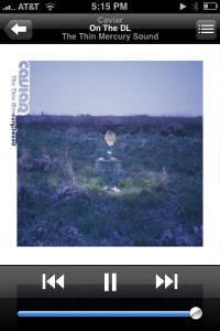
Playing songs in portrait mode is pretty good, too. You get full-screen artwork and nice big fast forward and rewind and pause/play buttons right where they’re most useful. But there are shortcomings:
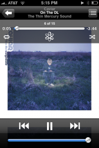
- Apple chose to devote a huge amount of screen real estate to a volume slider. But a visual indication of volume isn’t all that useful, and this is seldom used to change the volume on the iPhone since it has hard volume controls anyway! I’d have the volume be a pop-up on-demand slider like in Quicktime.
- That screen space could have been used for another much more useful slider – a forward/back scrubber bar! Instead, one has to tap the screen to get an overlay scrubber with repeat, shuffle, and Genius controls thrown in, too. Why are these things relegated to a pop-up that disappears and partially obscures the pretty artwork?
- And why is that popup hidden anyway? It’s not intuitive to tap the artwork to get to the scrubber…
- It’s awfully hard to actually use that scrubber, too. Queue up an hour-long podcast of “Wait, Wait, Don’t Tell Me” and you’ve got a challenge trying to skip forward to “Not my job!” My fingers wobble it forward and back in five or ten minute increments, so I have to resort to the scan forward/reverse mode.
- Scanning forward and back with the “arrow” controls is frustrating, too. It’s variable-speed, but the maximum “skip” is about 30 seconds so you have to hold the “button” down an awfully long time in a podcast!
- There’s also no visual indication of track number on the screen. They could be displayed along with the title at the top, but aren’t.
- How about playing time? I often want to know at a glance how far I am into a track, but I have to pop up the scrubber bar to see it. Ugh!
- And I’m one who uses stars to rate my tunes. But these are hidden in the alternate portrait screen (see below).
Lots of these issues could be solved by a quick refresh of the controls. Swap out the scrubber (with playing time) for the volume bar and add an obvious icon to pop up the secondary controls (volume, shuffle/repeat, Genius) and it would be an excellent start. Add stars and I’d be much happier!
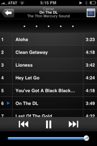
Then there is the alternate portrait-mode display, the song and stars list. I guess it makes sense to hide these “behind” the artwork, but the interface is frustrating again. Instead of tapping on the art (as in landscape/Cover Flow mode) to see the track listing, you have to tap a little toggle in the upper right corner. Weird!
This is the only place in the entire interface where you can see or modify rating stars for tracks. But you can only see the stars for the currently-playing track, and they’re nailed to the top of the screen rather than appearing “close” to the track name.
If you’re in this mode, playing controls are limited, too. You can’t access the scrubber popup, the shuffle/repeat controls, or Genius. And you can’t see how far into the song you are. All of this could be fixed by swapping the volume slider for the scrubber, of course.
One more portrait-mode issue: Both playing windows also displace the familiar “dock” of iPod icons at the bottom. Want to change artists or select a podcast instead? You have to use the arrow in the upper left corner. Not terrible, and at least it’s consistent, but I would have liked an OS X-like popup dock or something instead.
I know, I’m tough to please. And we haven’t talked about video controls or landscape mode yet!
A Beautiful Landscape
Let’s get this out of the way immediately: Cover flow in the touch iPod interface is beautiful. It’s a natural fit for swipe/flick gestures, and this is the mode that impresses in demonstrations to newbies. But once you start to actually use the iPod application in this mode, you realize how frustratingly limited it is.
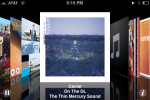
Where to start? How about a list of the things you can’t do in landscape mode:
- The most basic of all features, fast forward and reverse, are gone.
- The scrubber bar has been scoured away, and there’s no play time indicator either.
- What’s that? Nope, sorry, no volume slider.
- Shuffle and repeat are excised, too.
- Genius clearly wasn’t at work.
- There are no stars.
- Podcasts can’t be selected here, though they do show up in the ‘flow if you’re playing one already.
- Although videos only play in landscape mode, you can’t actually select them here!
- Landscape mode is album-only, causing weird behavior (see below).
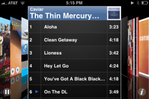
On second thought, maybe it would have been easier to just list the three or so controls that actually work in landscape mode! Of course, “work” is a relative term, and the teeny tiny play/pause button barely matches this description. Plus, although it’s pretty, flicking through cover flow gets tedious when more than a few dozen albums are present.
As reader Jame points out in the comments below, landscape mode also has a strange album-only fixation: Yes, it shows everything as an album in Cover Flow, but any actions you take also affect only that album. This can be surprising when shuffling songs, for instance, since a playlist or artist shuffle will transform into an album-only shuffle if you select a song in landscape mode. Try this: In portrait mode, select an artist with more than one album, select “All Songs”, and Shuffle. Now switch to landscape mode – you’ll see whatever album is playing at the time. Select a different song from that album by tapping on it. Suddenly you’re only shuffling that album! This is consistent with landscape mode’s album-only behavior, but will come as a surprise if you weren’t expecting it!
Video
One of the features that makes the iPhone and iPod Touch so nice is their large, high-resolution screens and native H.264 video capability. Watching movies and TV shows on these gadgets is truly a delight, and I probably spend more time with video than audio, to tell the truth.
Apple actually implemented many of my audio ideas in the video player, too. On touch, it shows not just “transport” controls (play/pause, forward, rewind), but also the scrubber bar and time counters. Although the big useless volume slider remains, it’s nice to have all of the different controls on screen by default. And it’s nice that there’s not some useless inconsistent button to touch to bring the controls up!

Another nice feature is the built-in zoom feature. The iPod interface offers two zoom levels: Full-width and full-height. This is great for movies that are encoded properly, since it can make widescreen content fill the screen better. Though I would never pan-and-scan or zoom on a full-size TV, I find I’m more accepting of these on a small portable device.
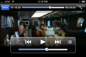
Another nice feature is the touch iPod’s handling of chapter markers. When a film has chapters, an extra icon appears to the right of the transport controls. Tapping on this brings up a list of chapters (also in landscape mode) similar to an album track listing. The skip forward and reverse buttons also jump from chapter to chapter nicely.

The touch iPod software is pretty solid for video. But here again, Apple’s interface lets me down in some areas:
- As mentioned before, you must select videos in portrait mode, but must watch them in landscape mode.
- Also as mentioned, videos do not show up in landscape cover flow, unlike iTunes and the Apple TV.
- Movies and TV shows won’t appear in the Genre list, but surprisingly music videos do. It seems like Apple don’t expect people to keep many movies on these devices, but that could change as 16 GB and 32 GB devices become more common!
- The scrubber bar is even less useful when watching movies, since a little movement can add up to five or ten minutes of “movie time”.
- “Variable speed” fast forward or rewind is ramped up in video mode, zipping up to two minutes at a time, but is still too slow for my tastes.
- There are only two zoom levels when playing movies. I’d love manual zoom, too. And the redundant zoom arrow button is a waste.
All in all, the video mode is the most satisfying, apart from the lack of landscape-mode title selection options.
One More Thing: Playlists
I admit that Apple’s iTunes playlists are kind of limited compared to some other systems, but they’re good enough for me. I especially like Smart Playlists in iTunes, and On-The-Go was a nice addition to the iPod. But the touch iPod could use some more playlist mojo. How about a button in the UI somewhere that adds the current playing song to the On-The-Go list? The real hard-button iPod has had this for a while! (Hint: It’s the hard button!)
In talking to some buddies, it seems like poor playlist management on the iPhone is their biggest gripe with the device. I have to admit, it wouldn’t even have made my top-10 list, but it’s there.
(In)Consistency
But the lack of controls in landscape mode and weird video selection aren’t my biggest gripes with the prettiest iPod interface ever – it’s the overall inconsistency between landscape and portrait, audio and video:
- The play/pause button moves from near bottom center (portrait) to (physical) top left/(virtual) bottom left (landscape music) to center (landscape video).
- I like that a tap on the cover (in ‘flow mode) brings up the track list. But why does it bring up something entirely different in portrait mode? And it does something else entirely (zoom) in video mode…
- Why is there a redundant “information” control in music landscape mode to bring up the track list with a completely different look and placement from the one in portrait mode?
- Then there’s the redundant zoom arrows in video mode…
- Why do the little blue arrows in the track list look like play/pause controls but not act like play/pause controls? This is obviously very minor, but I did try to tap them.
Apple really needs to revisit the touch iPod interface in the iPhone and iPod Touch. Make the controls consistent between different modes, remove the superfluous buttons, and focus on what people do. You know, this is exactly the kind of thing that Apple has always been really good at!
I hate the portrait mode song list. Because if you are crazy enough to click on a song there while you are in shuffle, it will then continue to shuffle the tunes from that album, not the library. Grrrr…
Oh wait another confusing one. Getting the mobile appstore content off your touch if you manage manually. You have to click on the menu in itunes. Huh?
Great point! The landscape (wide) mode song lists are ALWAYS album-only, a point that can easily be missed. I think I’ll add this up above!
When in landscape mode, in the list of songs in an album, the numbers are in order (does that make sense? =/ I mean it lists the songs by 1-2-3-4 etc).. wouldn’t it make more sense to show the actual track number? (I’m not one to add all the songs of a particular album to my iPod)