More than five years ago, I blogged about a “stupidly cool” terminal font. Now that Mac OS X isn’t a big cat anymore, I figured it was time to repeat that: If you’re an old-school computer nerd like me, Glass TTY VT220 is the coolest terminal font for Mac OS X!

For people of a certain age, nothing beats a green screen and a blinking block cursor. I can almost taste the Jolt Cola and Cool Ranch Doritos! Back at my alma mater, those terminals were so important that the sound they made became synonymous with hacking (in the true sense): Gweep!
Even with today’s “retina” displays, with all their astonishing color depth and TFT technology, gweeps like me spend much of our time gweeping in a terminal window. And there’s nothing that Terminal needs more than a sweet monospaced font!
Therefore, for your consideration, I present the ultimate Terminal font: Glass TTY VT220! That guy, bless him, transposed the original DEC fonts into a TrueType font file, complete with Cyrillic characters that were missing in the ROMs. Seriously – this is as accurate as you can get!
Back in the low-resolution dark ages (2010), I lamented that the font had to be used at an insane 20 points to be pixel-perfect. But today’s Retina MacBooks make a 20 point font downright desirable!

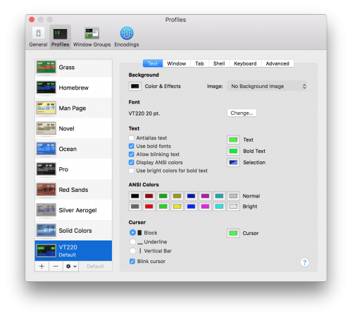
I did a little tweaking of the Terminal setup to get it how I liked it, but it’s pretty straightforward to have the ultimate Terminal font:
- Download the TrueType font: Glass TTY VT220
- Open it in Finder to launch FontBook and install it
- Open Terminal preferences and create a new default profile with this font at 20 points and a proper green/black color scheme
- Settle back with a Moxie or Zima and get on with the gweeping!
Love it! Thanks for this!
Thank you for the tip, now I just need my Hercules amber (one) color monitor. 😀
Try this out: https://github.com/Swordfish90/cool-retro-term
Yow. I always found the VT-220 font very hard on my eyes. I find the IBM 3270 font way clearer, & easier on the eyes: https://uploads.disquscdn.com/images/34d992526f57e9f1158acbfcce9e328bdae6939f2c72b81fa62eaf3a33ce664b.png more pleasing.
Found only now this post. Awesome looking font!
Well that brought a smile to this old guy! I started with an IBM 029 card punch and thought moving up to a DECwriter was heaven. Had to invent a new level of heaven when my fingers made characters appear on glass in front of me!
Thanks for the memories. I’ll keep this profile to show my grandson what he missed!